|
This post is from June 1, 2017, originally posted on Tumblr.  Right now, I’m working in a team of 4 to make a game based on Zelda II, so I was doing some research on concept art for the game. I mainly wanted to gather inspiration to try and capture the aesthetics of the game. Our game will definitely differ significantly from Zelda II (mostly in quality) so I thought concept art would be a good place to look for that core feeling of the game.
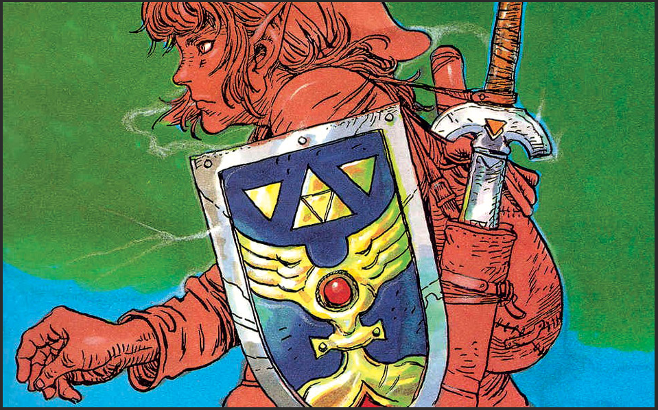
The difference between the generations of games, in this regard, is that concept art for old, NES and SNES games played a different role in development. On newer systems with photorealistic graphic capabilities, concept art aims to show accurately how characters and areas appear. Old concept art, on the other hand, wasn’t concerned with accuracy hardly at all, it seems. Proportions don’t matter when the developers are well aware the graphics will look nothing like real life. Link's body had very limited pixel real-estate.
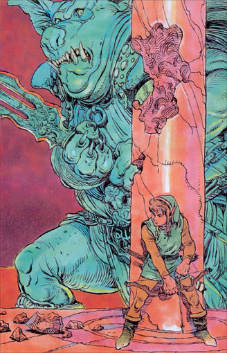
A prime example of this is the fact that the images below are the same scene. Both depict Link fighting the first boss of the game, the cleverly named Horsehead. All of the basic parts are shared in both: the stone, the pillars, the curtains, even the color of the boss’s armor. But when you compare them, the concept art is definitively more impressive than the gameplay. The light flooding in, the upward angle of the frame, Link’s anticipative stance all contribute to the scene of a powerful enemy towering over you. 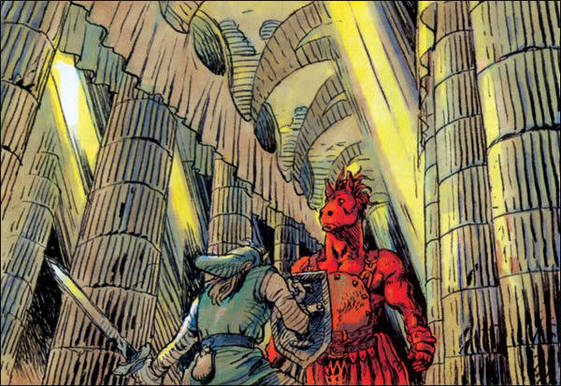 Still, when I played the game again recently, I discovered that viewing the concept art had an unexpected effect. I laughed at the concept art, at the juxtaposition of coolness between what the game should be and what it is. But when I was playing through this first dungeon, I entered the final room, I saw the curtains hanging down, Horsehead patiently waiting for me, and I got a shiver down my spine. I played the game and I remembered the concept art. In a way, it conceptualized for me the aesthetic experience of the battle. It felt so much more exciting. 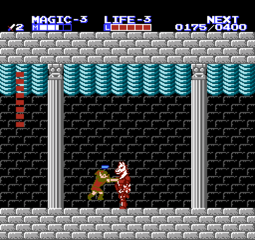 The game we completed is called Monumental Pain and can be played on Itch.io here:
kwu.itch.io/monumental-pain
0 Comments
Leave a Reply. |
Kiefer NemethI like games. I hope to one day make them as a means of survival. 
Archives
January 2021
|